Role: Web Developer / Designer
Project Type:
Consumer Facing Website
Web Development
Web Design
Deliverables:
Updated Syling
Enhanced CSS Grid Framework
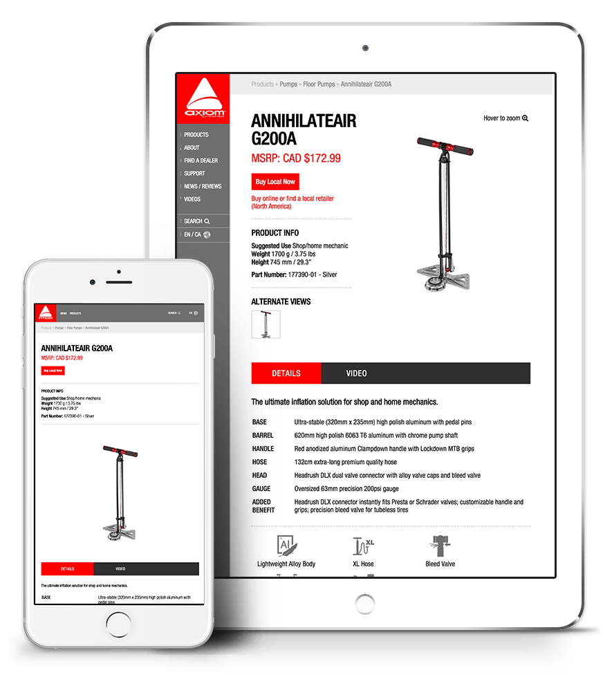
Updated Product List
Image and Video Assets
Contributors:
Devin O'rourke
Project Overview
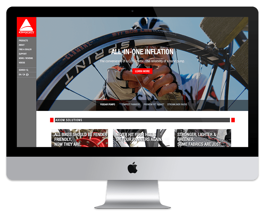
Axiomcycling.com received a fresh redesign that utilized a full width layout and responsive side bar navigation. I developed my own CSS grid framework that uses shorthand classes, making development easier and more fluid. The result was a fully responsive 16 column grid site that generated remarks such as “Axiom has never looked so good.”
Responsive Sidebar Navigation
CSS Shorthand Classes
Feature Slider
Process And Approach
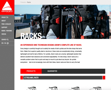
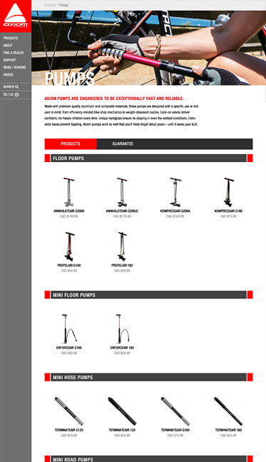
To compliment Axiom Cycling Gear's square logo I decided to design and develop a side bar navigation. This type of navigation created the affordance for a full width responsive layout which was accomplished with the use of a 16 column CSS grid framework.
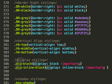
I used this project as an opportunity to update my already existing 12 column CSS grid framework to a 16 column grid as well as add CSS short hand classes for commonly used styles. This allows me to design in the browser and solve design challenges that were not present in the mock up faze.
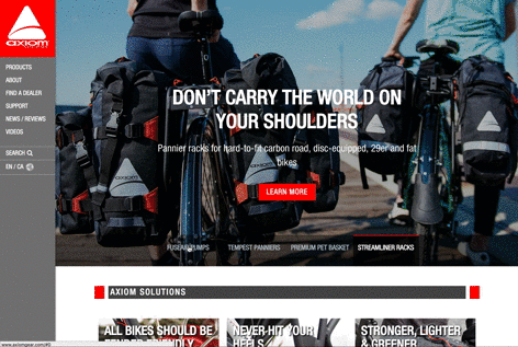
One of the goals for the 2016 redesign was to generate captivating imagery. To highlight these images on the homepage I modified an open source plug-in from codyhouse.com that provided a dynamic responsive feature slider. In order to easily add or remove feature images I used PHP while loops to add content to the slider from a MySQLi database.
Process And Approach
To compliment Axiom Cycling Gear's square logo I decided to design and develop a side bar navigation. This type of navigation created the affordance for a full width responsive layout which was accomplished with the use of a 16 column CSS grid framework.
I used this project as an opportunity to update my already existing 12 column CSS grid framework to a 16 column grid as well as add CSS short hand classes for commonly used styles. This allows me to design in the browser and solve design challenges that were not present in the mock up faze.
One of the goals for the 2016 redesign was to generate captivating imagery. To highlight these images on the homepage I modified an open source plug-in from codyhouse.com that provided a dynamic responsive feature slider. In order to easily add or remove feature images I used PHP while loops to add content to the slider from a MySQLi database.
Responsive Sidebar Navigation
CSS Shorthand Classes
Feature Slider
Browse Category
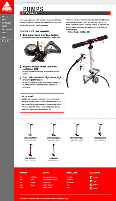
Browse Subcategory
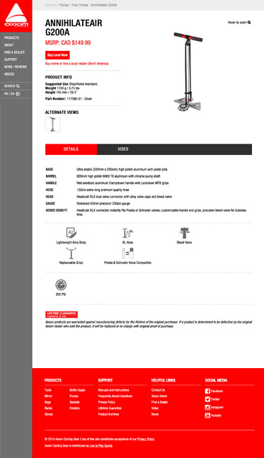
Browse Product
Highlights
The full width 16 column layout afforded for more white space between elements, giving the website a more premium feel. This styling allowed us to highlight the key features of each products and provide better browsing experience. With larger displays becoming increasingly popular, the use of a sidebar navigation effectively utilizes the extra horizontal real-estate and provides a visual anchor for all the elements on the page. The 2016 redesign was a successful launch that encapsulated the new direction for the brand.